It helps people understand the capabilities of a modern web browser easier.
The color-coding is intended to help web developers think on if they can use as a feature on their site. If your audience is on a modern web browser (not IE 11), the medium shade of green is enough. If you only need some users to have the feature, then dark green is enough. If you only care about Chrome, you can use the APIs in blue.
Nice. Some suggestions:
1) Show some expanded information on hover;
2) Put (more) links to Wikipedia/CanIUse;
3) Allow some kind of resize. Even if I zoom out in Chrome I cannot see all the periodic table at once;
4) Maybe the rows must be organized by "relevant" ratio. So currently used will be on top and obsolete/deprecated in bottom;
5) Yet on 4, maybe we can customize the order?
6) Missing a "Server side" column for ASP.Net, Php, etc...
7) Allow hide/show columns
This is very useful, thank you. I had to zoom out to get an overview and the legend overlapped with the top left of the table. If it could scale to different sizes more clearly and smoothly that would be an improvement I think. But I understand if you don't intend to make changes, and it's also great as it is, thanks very much for releasing!
The colour coding doesn't really have good-enough contrast.
I can't personally distinguish the three first colours. I can tell they're somehow different, but can't tell which is which. All three are some kinda of "olive-like greenish".
It's funny, I've always read a lot about these accessibility issues, but this is the first time I find myself affected by one to the point where I can't interpret something.
I think this is a worthwhile exercise but the years make no sense at all. CSS was proposed in 1994, not 2015. It's off by literally 2 decades. Also XHTML was released in 2000... By 2010 it was almost obsolete with HTML5 coming out 4 years later
I considered, especially since this is a Show HN, to not say anything and let it slide, but considering the potential long tail for negative effects, where web dev circles are already filled with mildly annoying falsehoods and crazy beliefs, it seems kind of irresponsible to opt for letting it slide out of some (possibly mistaken) notion of politeness.
There are some bad conclusions that can be drawn from this chart, if not just downright bad info contained in it, at least in its current form.
For example, if the date labels are going to be this arbitrary, it would probably be better to just omit them altogether.
That reminds me of the time someone online pointed out that customers did in fact believe "essential oils" to mean "these are essential = required for survival", not "these constitute essences = extracts of a plant's ingredients".
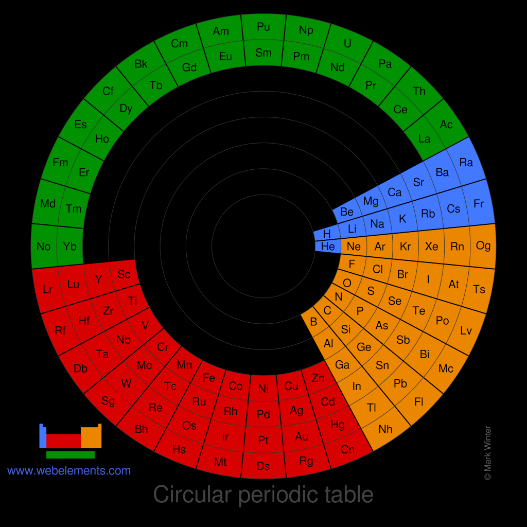
I don't think the people that create "periodic tables" for other areas understand the principles behind the actual periodic table of elements. I've never seen any example that had any kind of underlying principle like the real thing.
Well, it's worth delving a bit into the history of the periodic table of the elements to understand how it came to be.
Lavoisier is usually credited with the first systematic list of the elements, partially because he's generally credited as being the father of modern chemistry and is associated with the transition from alchemy to chemistry. His list, published in 1789, does have some errors: he included "light" and "caloric" (aka heat), and several metals are given in oxide form instead of pure form (e.g., magnesium, calcium, molybdenum, barium). There's no inherent order to the list.
As stoichiometry develops over the next few decades, chemists begin to discover the atomic weights of elements, and further establish relative ratios of elements in compounds, so we can identify that (say) magnesium oxide has magnesium and oxygen in a one-to-one ratio, whereas sodium oxide has a two-to-one ratio.
Parallel to this effort, it also becomes readily apparent that there are some groups of elements that behave very similarly--today, we'd call these the alkali metals (first column), alkaline earth (second column), chalcogens (third column from right; least used of the list), and the halogens (second column from right).
By the 1860s, these patterns and the atomic masses are starting to be combined into two-dimensional tables, taking a list of elements with increasing masses and chopping it off every so often to make a new row. Mendeleev wasn't the first to create this kind of table, but he was the first to recognize that some of the data was wrong [1], and most importantly, he discovered several periodic trends in the process that allowed him to predict the properties of unknown elements, with gallium and germanium the most ringing successes.
The periodic table we get in the 19th century does not look like our modern periodic table, though. It creates 8 groups of elements, with group VIII comprising three elements in a row (the columns headed by iron, cobalt, and nickel in the modern table). When noble gasses were discovered, they were combined into a Group 0. Not every row would have a group 0 and group VIII entry. Pretty much all of the tables from this era will list groups with their oxide/hydride valencies, which should give you an idea of how the groups are organized.
It's not until the early 20th century that chemists began to develop the theory of atomic numbers, and shortly thereafter electron configuration. This leads to the development of the periodic table dominated by increasing atomic number instead of increasing atomic weight, and also begins to recognize that the table isn't a simple table but has a more stair-step design, comprising what we would now call the s block (left two columns), p block (right 6 columns), d block (middle mass), and f block (the lanthanide and actinide series).
This development helps settle the issues with rare earth elements--the lanthanides don't make sense in view the old periodic table layout (there's too many of them!), although it also doesn't help that separating the lanthanides from one another is so difficult that several elements were later shown to be mixtures of different lanthanides. It really doesn't help organizing known elements into a table when your input data is wrong!
That said, if you pay careful attention to modern periodic tables, you will notice that there is one place where tables differ. Which elements are placed below yttrium? Is lanthanum and actinium in the main table? Or is lutetium and lawrencium in the main table? Or do you create a gap below yttrium and place both lanthanum and lutetium in the supplemental series at the bottom? Organizing the lanthanides is still an unsolved problem for chemists!
[1] At the time, the way of calculating atomic mass meant you had to make a guess at valency to compute the atomic mass. If the valency was wrong, then the atomic mass would be wildly off.
"The columns are organized left-to-right by the date an API in that column was first implemented. Older first.
The rows are organized by the date they were first proposed.
The first row represents technologies that still work, but are superseded or obsoleted by newer technologies.
The second-to-last row is deprecated or abandoned APIs. These may have been implemented before and removed, or only partly implemented.
The last row is for APIs that only ever worked in one browser. Many of these are proprietary or vendor-specific APIs."
The parent is an interesting comment as I thought just everybody would learn about the periodic table of elements in school. Basic education seems to differ really widely.
It would be nicer if it resized with the browser but such that it fits inside the viewport, instead of cutting off after "semantic" regardless of how big the viewport is set.
It's a joke that if an API is Chrome-only, it might as well be proprietary.
Chrome-only (neither supported by Firefox or Safari) APIs typically have less concern for privacy and security. For example, Web MIDI lets a web browser install arbitrary binary executables on MIDI devices.
It helps people understand the capabilities of a modern web browser easier.
The color-coding is intended to help web developers think on if they can use as a feature on their site. If your audience is on a modern web browser (not IE 11), the medium shade of green is enough. If you only need some users to have the feature, then dark green is enough. If you only care about Chrome, you can use the APIs in blue.